Mobile Ready
The one-click smartphone and tablet simulator for your browser. Preview any website on iPhone 15, Galaxy S22, Pixel 6, iPad Air and 55+ realistic device frames — built for designers, developers and product teams to test, capture and demo without leaving the tab.
Trusted by teams at
Everything you need to design and demo responsive.
A small toolbar with massive impact. Switch viewports, inspect styles, align pixels and present — without juggling DevTools.
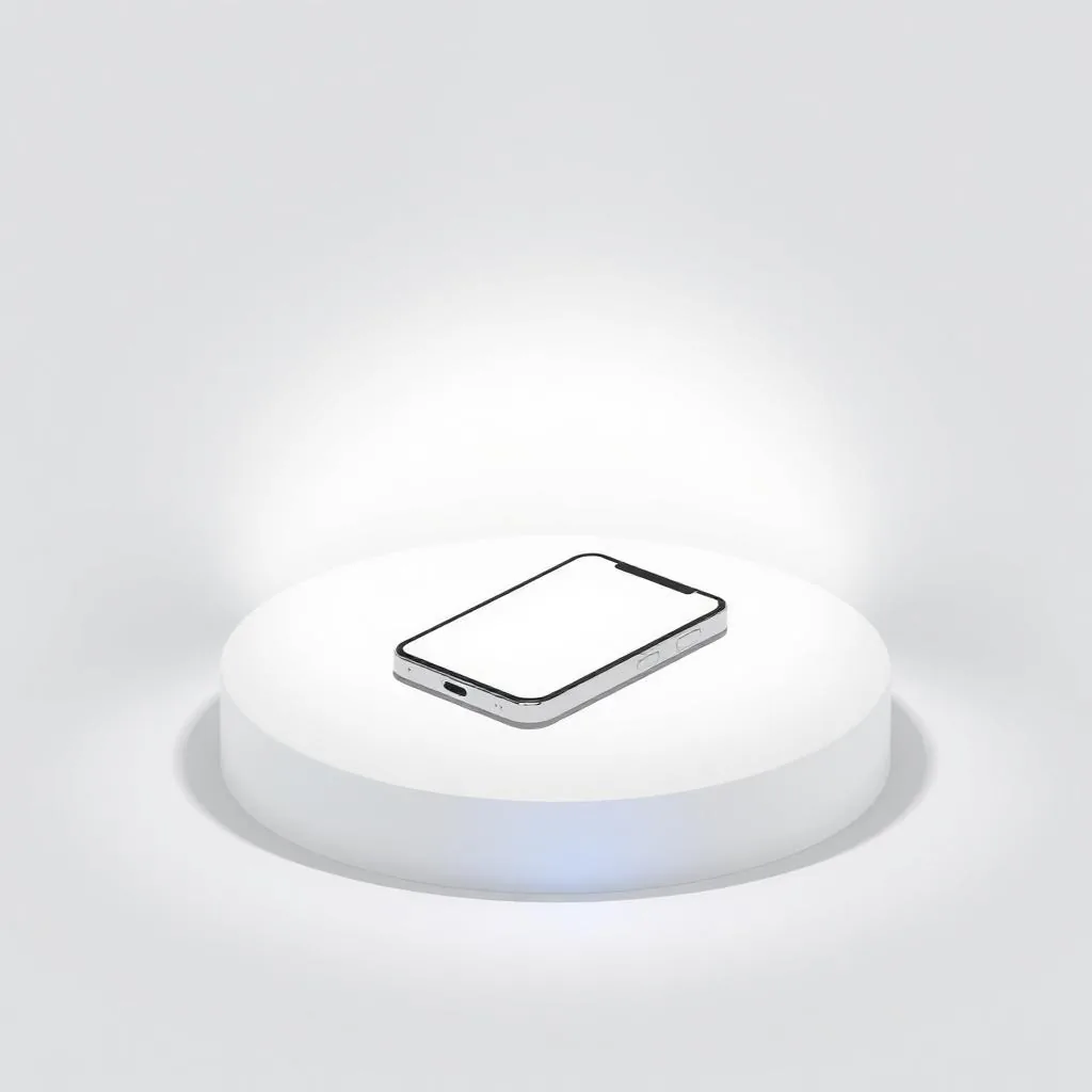
One-click simulation
Snap any tab into a realistic device frame instantly — no reload or resize gymnastics.
55+ realistic devices
iPhone, iPad, Pixel, Galaxy, Surface and more — kept up to date for every new release.
HD screenshots & annotations
Export crisp PNGs and mark them up with arrows, text and shapes for feedback in seconds.
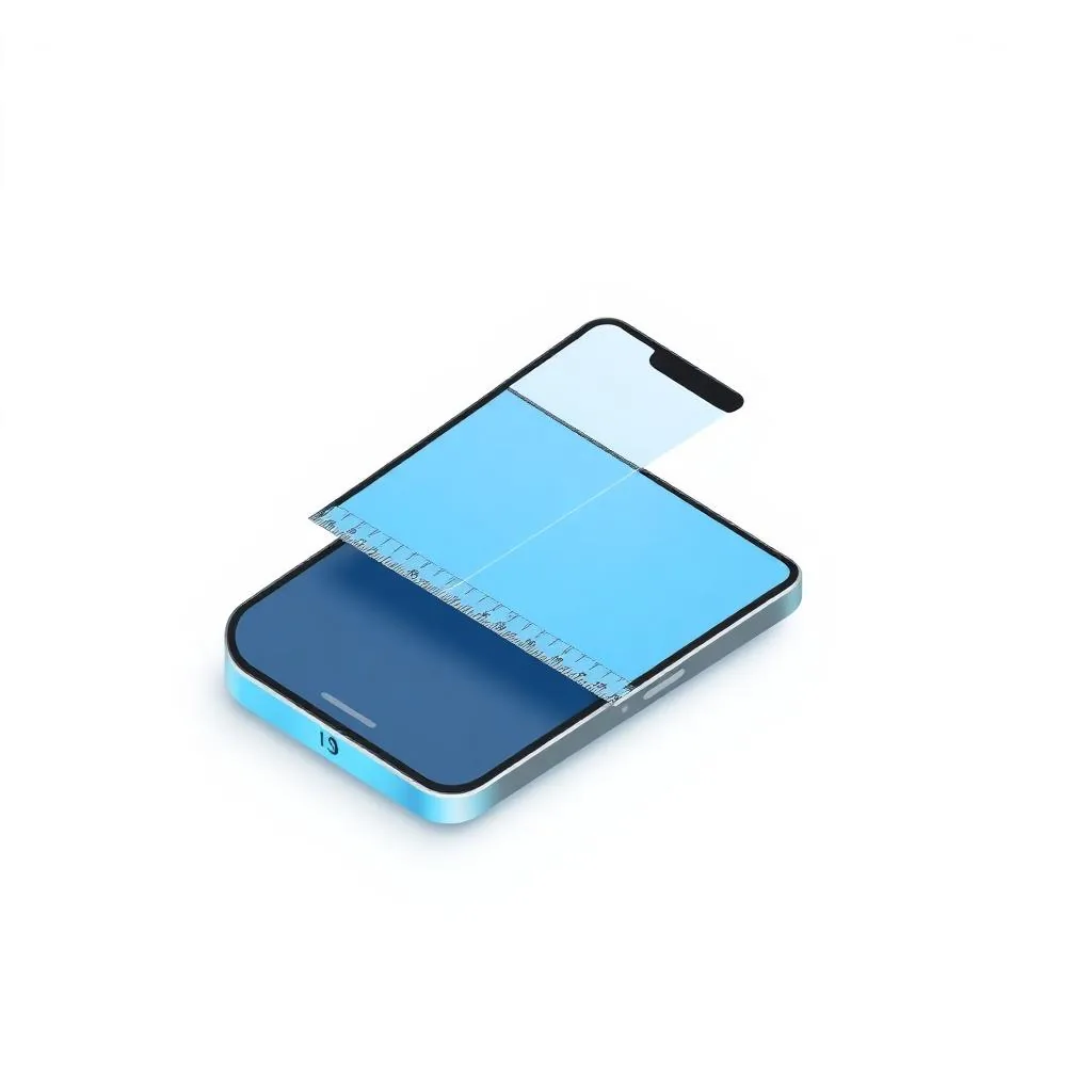
Alignment rulers
Drag unlimited vertical and horizontal guides from the edges to align every pixel on any device.

Element inspector & live styling
Inspect fonts, padding and colors, tweak CSS live and copy the result straight to your clipboard.
Presentation mode
Hide every menu and button for spotless client demos and recordings.
Ready to simulate every device?
Install the free plan today. Upgrade anytime for HD captures and team features.